



Design System Adaptation | UX + UI Design | B2B eCommerce | Beta Testing | Competitor Analysis
Royal Canin
Royal Canin is a leader in pet food supply, specifically catering to professional vet services and prescription food diets. Their ‘pro’ account platform is a business-to-business (B2B) eCommerce experience that allows vetrinarians, breeders, retailers and shelters to order food supplies in large quantities. Their business partnerships are strong but their website was lacking modern features.
I worked with the team at Royal Canin to design a new auto-reorder feature that would let ‘professional’ account users subscribe to automated orders. Next, we redesigned the account page experience by creating an interactive dashboard unique to customer segments.
UI Design
Royal Canin’s design system is determined by its parent company, Mars Petcare. Any new website features needed to adhere to nuanced design styles already in use. This meant adopting the current styles and reusing as many components as possible for UI consistency and an efficient development process.
Autoship Feature
The company wanted to present a new feature to users that felt modern and familiar. Subscription and auto-reorder models are prevalent in today’s eCommerce space and Royal Canin knew their users would adopt quickly if the tool was easy to use. Order management would also need to be integrated into existing account tools.
Account Dashboard
The existing B2B website offers a lot of powerful tools and self-service actions that users do not take advantage of. Royal Canin requested an enhanced design of the account dashboard, that would emphasize the features users were not utilizing.
‘Autoship’ feature integrated with homepage design for high-visibility of the new tool.
Constructing an Intuitive User Flow
We knew introducing a new feature to users that are comfortable with their existing user experience would need to be handled smartly. Royal Canin professional account users prioritize efficiency. By collaborating with the client team, project management, and developers, we decided the best interface for the autoship tool would be a modal design. With this approach, we’d be able to guide users through simple steps for an intuitive setup experience. Another reason for choosing the modal interface is that it would allow us to integrate the autoship setup on any page. We could promote this tool on product pages, order history pages, the homepage, and more. Entering the user flow setup through a modal would keep users siloed in their setup journey without leaving the previous page experience.

Successfully implementing an intuitive user flow would increase the adaption rate of a new feature and guarantee repeat orders.
‘Autoship’ modal interface entered from a product detail page. Features the ability to edit line item quantities and add new products to the order.
Searching and adding additional products within the Autoship modal.
Setting up shipment and payment details to submit a new autoship order.
Working Together to Design Autoship Management Tools
Once the user flow of the autoship experience was established, we addressed how users would manage their autoship orders. We wanted to stay very consistent with the existing ‘Order History’ pages with the added functionality of autoship details. I worked side-by-side with team members to design and define detailed functional documentation. With client stakeholder preferences taken into account, we landed on a file design experience. The ‘Autoship Management’ page would be displayed as tables that could be filtered, sorted, and organized into tabs. The editing experience would adhere to the modal experience previously established. Special considerations were made to guarantee clear messaging to the user when making edits to their autoship orders. Multiple notification messages were designed to communicate with users regarding actions like ‘skip order,’ ‘order now,’ and ‘cancel autoship.’
Autoship Management page featuring tabbed table selection of ‘active’ and ‘canceled’ orders, column sorting. Advanced filtering includes product keyword search, date selection, and customer data.
Open ‘Edit’ modal to adjust existing autoship order details including delivery frequency, product selection, and billing details. Users can also ‘Skip Order’, ‘Order Now’ or ‘Cancel Autoship’ orders.
Staged Releases via Beta Testing
Since the autoship feature will be a new tool for Royal Canin users, the client requested a slow release to users per customer segments. The first release (2026) was tested with a small group of hand-selected customers. These are customers the client has picked based on trusted business relationships. So far, broad feedback has been overall positive. Royal Canin representatives are gathering informal opinions on the feature through conversations with clients. Once the tool has been in use for three months, user surveys will be distributed to beta testers to evaluate user journeys, potential friction points, and successful operations in more detail. Upon the completion of beta-testing analysis and necessary bug fixes, the autoship feature is planned to launch in full through tiered customer segment releases by the end of the year.
Sample of notification messages designed to communicate specific details to users regarding order information and dates.
Phase 2: Account Dashboard Redesign
Royal Canin requested a reorganization of content on the user’s account management page. For a simple solution, the page could have benefited from grouping like-links to reduce information fatigue and potentially merge related actions into single pages. However, with a more strategic approach, a full redesign concept was presented to the client. First, extensive market research was conducted and a proof of concept was presented to the client.
THE PROBLEM TO SOLVE:
“The account menu just feels like a long list of links. We’ve lost track of organizing the content.”
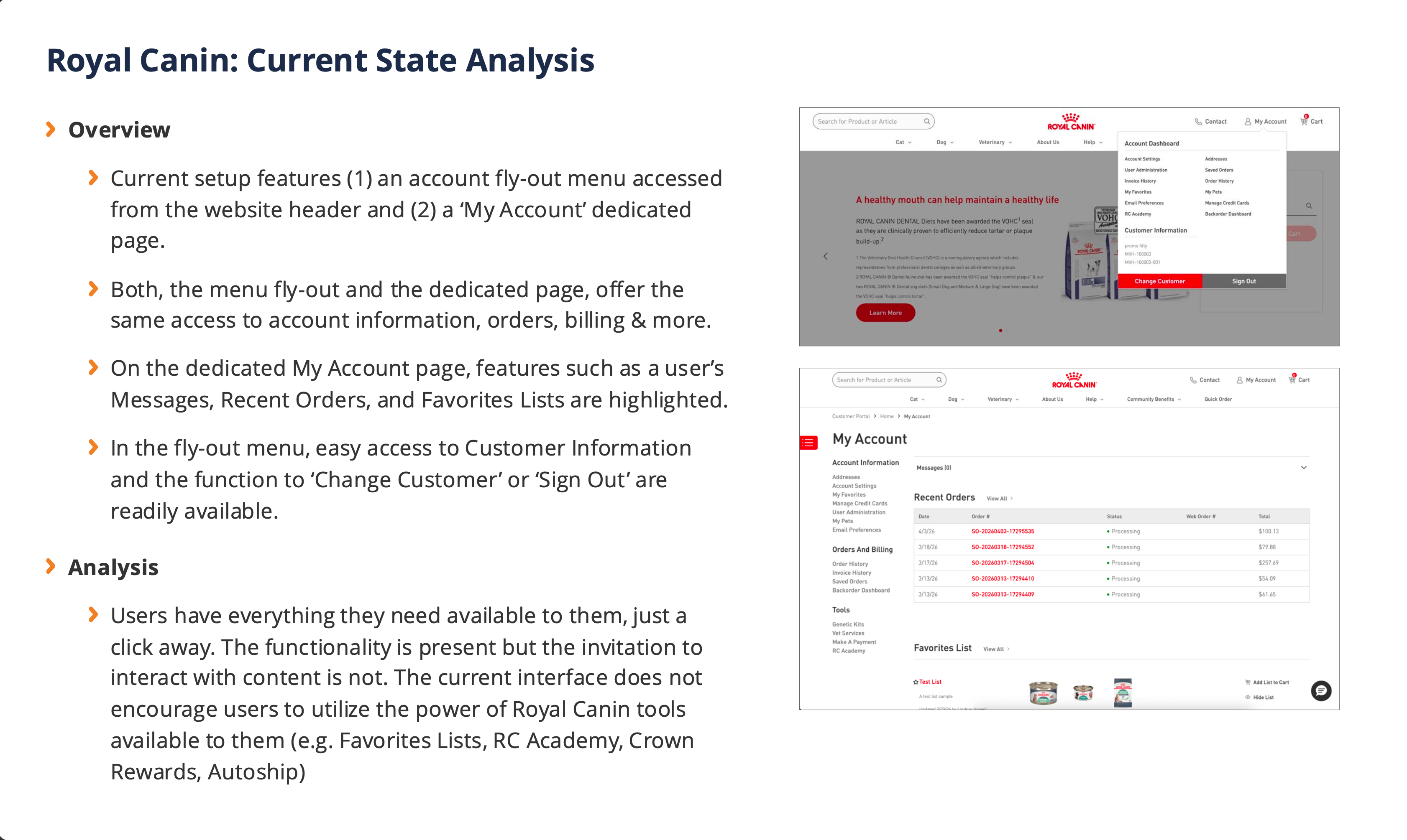
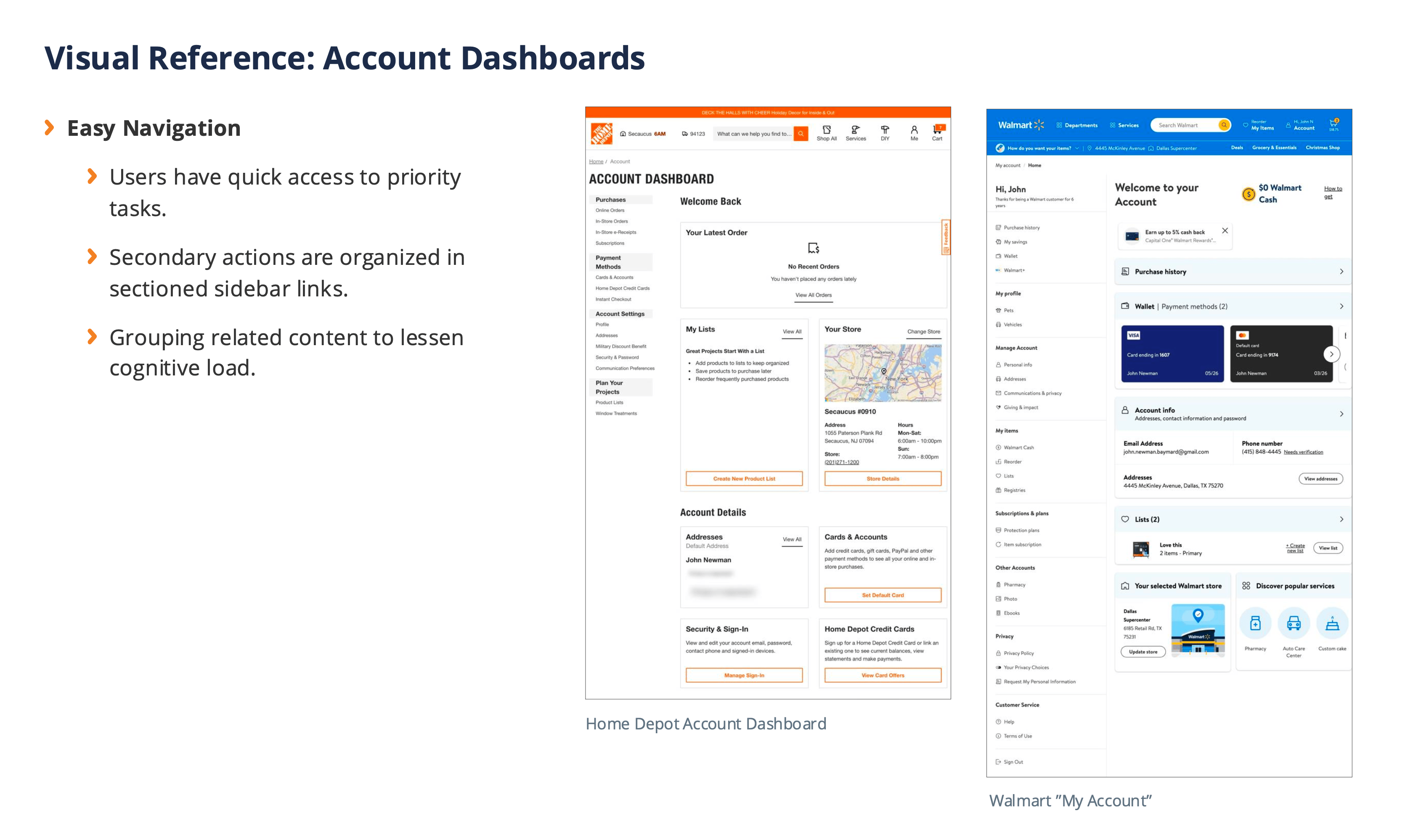
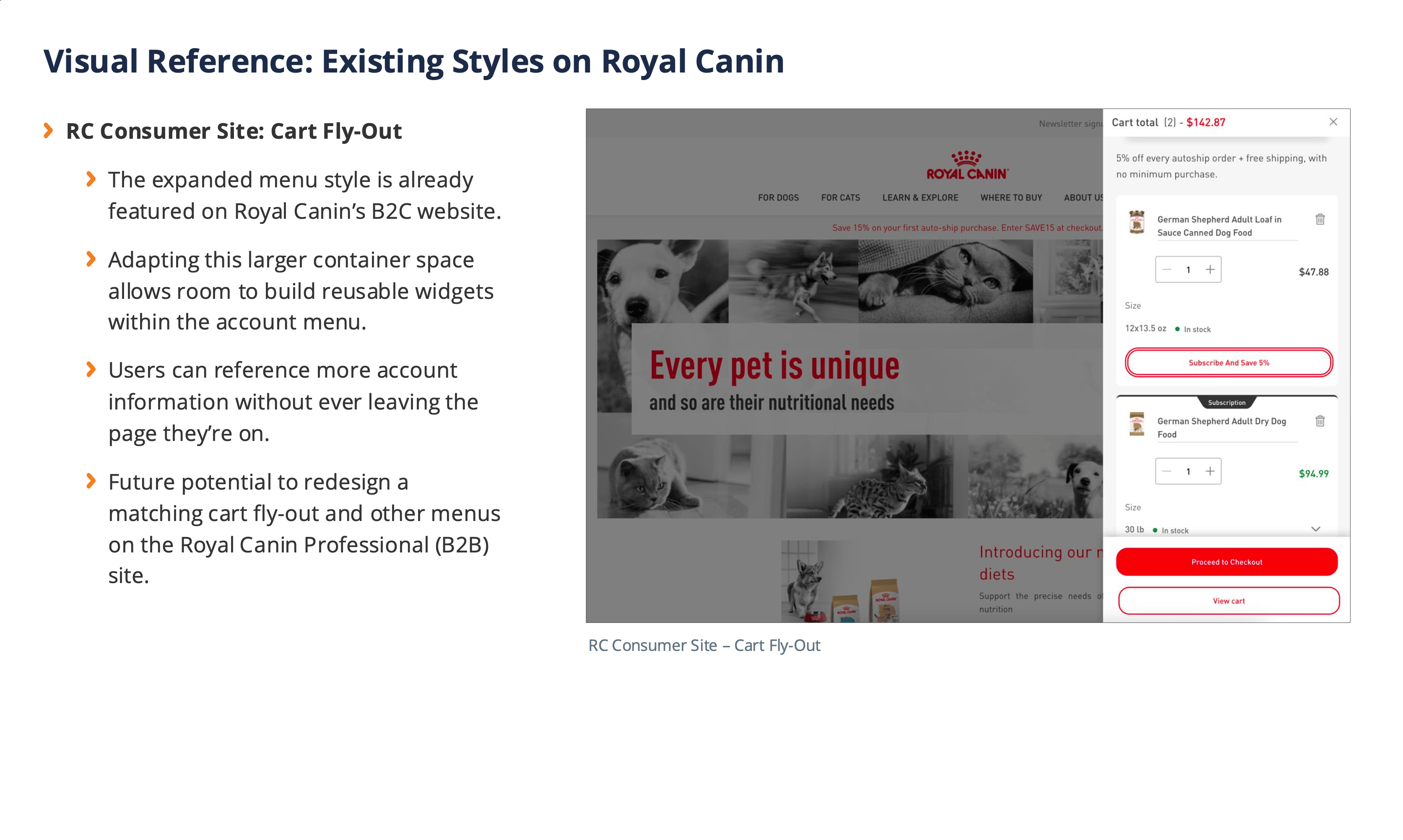
Sample pages from proof of concept proposal. Includes website analysis, market research, and bringing attention to reinforcing existing site styling for quick, consistent design implementation.
Customer Segmentation and Account Experiences
Royal Canin users are highly segmented. There is a base of four user variations that are broken down further for individualized content, settings, and tools available. It’s vital that new account experiences would not only honor those variants, but highlight those features even further. We wanted to be able to create easy access points to tools and account details that users referenced often and bring more attention to resources that some users aren’t aware they have access to. The redesign needed to be easy to manage and organized so that no user variant experience felt ‘better than’ or ‘lacking’ in comparison to others.
11
CUSTOMER SEGMENTS

Vetrinarians, breeders, shelters, retailers
Custom experiences for user variants
Unique program access based on roles
100+
MARKETS SERVED
Diverse professional audiences
Global market leader in prescription pet food
Millions of monthly website visits
Drafted proof of concept for the user’s ‘My Account’ page featuring reorganized content and custom widgets for features like ‘Autoships’ and ‘Crown Rewards.’
Modular, Responsive Content
One of the goals of the account redesign was to make a big design impact with a short development timeline. With this in mind, the proposed concepts relied heavily on reusable responsive widgets on both the account page and account menu designs. The original account menu was a list of links that started to feel unorganized and cluttered. The proposed drawer-style menu emphasizes priority content in a way that mimics the full account page experience. The content is organized with sections for quick access actions, customer information and sales representative contact information. After that, customer segmentation determines custom content available to the user through their menu dashboard. Styling the account menu in a new, modular drawer container not only lends itself to friendly responsive designs but also provides a more modern look and feel for users.
Before
After
Searching and adding additional products within the Autoship modal (top). Setting up shipment and payment details to submit a new autoship order (bottom).
Project Highlights
Extensive competitor analysis and user research provided informed design decisions and helped client visualize proposed strategies with confidence.
Expedited timelines and close collaboration with project managers lead to user experience designs and functional documentation created successfully in tandem.
Worked alongside development partners to ensure a seamless handoff from approved design concept to implementing new functionality.
View More Featured Work

Syndicate Floral
UX + UI Design, Design System Creation, B2B eCommerce
View the Case Study →
Wolters Kluwer Health
UI Design, Design System Management, SaaS, Brand Design, Marketing
View the Case Study →
Lindsay Howell
Design System Adaptation | UX + UI Design | B2B eCommerce | Beta Testing | Competitor Analysis
Royal Canin
Royal Canin is a leader in pet food supply, specifically catering to professional vet services and prescription food diets. Their ‘pro’ account platform is a business-to-business (B2B) eCommerce experience that allows vetrinarians, breeders, retailers and shelters to order food supplies in large quantities. Their business partnerships are strong but their website was lacking modern features.
I worked with the team at Royal Canin to design a new auto-reorder feature that would let ‘professional’ account users subscribe to automated orders. Next, we redesigned the account page experience by creating an interactive dashboard unique to customer segments.
UI Design
Royal Canin’s design system is determined by its parent company, Mars Petcare. Any new website features needed to adhere to nuanced design styles already in use. This meant adopting the current styles and reusing as many components as possible for UI consistency and an efficient development process.
Autoship Feature
The company wanted to present a new feature to users that felt modern and familiar. Subscription and auto-reorder models are prevalent in today’s eCommerce space and Royal Canin knew their users would adopt quickly if the tool was easy to use. Order management would also need to be integrated into existing account tools.
Account Dashboard
The existing B2B website offers a lot of powerful tools and self-service actions that users do not take advantage of. Royal Canin requested an enhanced design of the account dashboard, that would emphasize the features users were not utilizing.
‘Autoship’ feature integrated with homepage design for high-visibility of the new tool.
Constructing an Intuitive User Flow
We knew introducing a new feature to users that are comfortable with their existing user experience would need to be handled smartly. Royal Canin professional account users prioritize efficiency. By collaborating with the client team, project management, and developers, we decided the best interface for the autoship tool would be a modal design. With this approach, we’d be able to guide users through simple steps for an intuitive setup experience. Another reason for choosing the modal interface is that it would allow us to integrate the autoship setup on any page. We could promote this tool on product pages, order history pages, the homepage, and more. Entering the user flow setup through a modal would keep users siloed in their setup journey without leaving the previous page experience.
Successfully implementing an intuitive user flow would increase the adaption rate of a new feature and guarantee repeat orders.
‘Autoship’ modal interface entered from a product detail page. Features the ability to edit line item quantities and add new products to the order.
Searching and adding additional products within the Autoship modal.
Setting up shipment and payment details to submit a new autoship order.
Working Together to Design Autoship Management Tools
Once the user flow of the autoship experience was established, we addressed how users would manage their autoship orders. We wanted to stay very consistent with the existing ‘Order History’ pages with the added functionality of autoship details. I worked side-by-side with team members to design and define detailed functional documentation. With client stakeholder preferences taken into account, we landed on a file design experience. The ‘Autoship Management’ page would be displayed as tables that could be filtered, sorted, and organized into tabs. The editing experience would adhere to the modal experience previously established. Special considerations were made to guarantee clear messaging to the user when making edits to their autoship orders. Multiple notification messages were designed to communicate with users regarding actions like ‘skip order,’ ‘order now,’ and ‘cancel autoship.’
Autoship Management page featuring tabbed table selection of ‘active’ and ‘canceled’ orders, column sorting. Advanced filtering includes product keyword search, date selection, and customer data (left). Open autoship order within a table row accessed through the ‘Show Details’ link, displaying order line items and available order actions (right).
Open ‘Edit’ modal to adjust existing autoship order details including delivery frequency, product selection, and billing details. Users can also ‘Skip Order’, ‘Order Now’ or ‘Cancel Autoship’ orders.
Staged Releases via Beta Testing
Since the autoship feature will be a new tool for Royal Canin users, the client requested a slow release to users per customer segments. The first release (2026) was tested with a small group of hand-selected customers. These are customers the client has picked based on trusted business relationships. So far, broad feedback has been overall positive. Royal Canin representatives are gathering informal opinions on the feature through conversations with clients. Once the tool has been in use for three months, user surveys will be distributed to beta testers to evaluate user journeys, potential friction points, and successful operations in more detail. Upon the completion of beta-testing analysis and necessary bug fixes, the autoship feature is planned to launch in full through tiered customer segment releases by the end of the year.
Sample of notification messages designed to communicate specific details to users regarding order information and dates.
Phase 2: Account Dashboard Redesign
Royal Canin requested a reorganization of content on the user’s account management page. For a simple solution, the page could have benefited from grouping like-links to reduce information fatigue and potentially merge related actions into single pages. However, with a more strategic approach, a full redesign concept was presented to the client. First, extensive market research was conducted and a proof of concept was presented to the client.
THE PROBLEM TO SOLVE:
“The account menu just feels like a long list of links. We’ve lost track of organizing the content.”
Sample pages from proof of concept proposal. Includes website analysis, market research, and bringing attention to reinforcing existing site styling for quick, consistent design implementation.
Customer Segmentation and Account Experiences
Royal Canin users are highly segmented. There is a base of four user variations that are broken down further for individualized content, settings, and tools available. It’s vital that new account experiences would not only honor those variants, but highlight those features even further. We wanted to be able to create easy access points to tools and account details that users referenced often and bring more attention to resources that some users aren’t aware they have access to. The redesign needed to be easy to manage and organized so that no user variant experience felt ‘better than’ or ‘lacking’ in comparison to others.
11
CUSTOMER SEGMENTS
Vetrinarians, breeders, shelters, retailers
Custom experiences for user variants
Unique program access based on roles
100+
MARKETS SERVED
Diverse professional audiences
Global market leader in prescription pet food
Millions of monthly website visits
Drafted proof of concept for the user’s ‘My Account’ page featuring reorganized content and custom widgets for features like ‘Autoships’ and ‘Crown Rewards.’
Modular, Responsive Content
One of the goals of the account redesign was to make a big design impact with a short development timeline. With this in mind, the proposed concepts relied heavily on reusable responsive widgets on both the account page and account menu designs. The original account menu was a list of links that started to feel unorganized and cluttered. The proposed drawer-style menu emphasizes priority content in a way that mimics the full account page experience. The content is organized with sections for quick access actions, customer information and sales representative contact information. After that, customer segmentation determines custom content available to the user through their menu dashboard. Styling the account menu in a new, modular drawer container not only lends itself to friendly responsive designs but also provides a more modern look and feel for users.
Before
After
Current account menu design (left). Concept mockup for proposed redesign of account menu (right).
Project Highlights
Extensive competitor analysis and user research provided informed design decisions and helped client visualize proposed strategies with confidence.
Expedited timelines and close collaboration with project managers lead to user experience designs and functional documentation created successfully in tandem.
Worked alongside development partners to ensure a seamless handoff from approved design concept to implementing new functionality.
View More Featured Work
Syndicate Floral
UX + UI Design, Design System Creation, B2B eCommerce
View the Case Study →
Wolters Kluwer Health
UI Design, Design System Management, SaaS, Brand Design, Marketing
View the Case Study →
Lindsay Howell
Design System Adaptation | UX + UI Design | B2B eCommerce | Beta Testing | Competitor Analysis
Royal Canin
Royal Canin is a leader in pet food supply, specifically catering to professional vet services and prescription food diets. Their ‘pro’ account platform is a business-to-business (B2B) eCommerce experience that allows veterinarians, breeders, retailers and shelters to order food supplies in large quantities. Their business partnerships are strong but their website was lacking modern features.
I worked with the team at Royal Canin to design a new autoship feature that would let ‘professional’ account users subscribe to automated orders. Next, we redesigned the account management experience by creating an interactive dashboard with unique features according to customer segmentation.
UI Design
Royal Canin’s design system is determined by its parent company, Mars Petcare. Any new website features needed to adhere to nuanced design styles already in use. This meant adopting the current styles and reusing as many components as possible for UI consistency and an efficient development process.
Autoship Feature
The company wanted to present a new feature to users that felt modern and familiar. Subscription and auto-reorder models are prevalent in today’s eCommerce space and Royal Canin knew their users would adopt quickly if the tool was easy to use. Order management would also need to be integrated into existing account tools.
Account Dashboard
The existing B2B website offers a lot of powerful tools and self-service actions that users do not take advantage of. Royal Canin requested an enhanced design of the account dashboard, that would emphasize the features users were not utilizing.
‘Autoship’ feature integrated with homepage design for high-visibility of the new tool.
Constructing an Intuitive User Flow
We knew introducing a new feature to users that are comfortable with their existing user experience would need to be handled smartly. Royal Canin professional account users prioritize efficiency. By collaborating with the client team, project management, and developers, we decided the best interface for the autoship tool would be a modal design. With this approach, we’d be able to guide users through simple steps for an intuitive setup experience. Another reason for choosing the modal interface is that it would allow us to integrate the autoship setup on any page. We could promote this tool on product pages, order history pages, the homepage, and more. Entering the user flow setup through a modal would keep users siloed in their setup journey without leaving the previous page experience.
Successfully implementing an intuitive user flow would increase the adaption rate of a new feature and guarantee repeat orders.
‘Autoship’ modal interface entered from a product detail page. Features the ability to edit line item quantities and add new products to the order.
Searching and adding additional products within the Autoship modal.
Setting up shipment and payment details to submit a new autoship order.
Working Together to Design Autoship Management Tools
Once the user flow of the autoship experience was established, we addressed how users would manage their autoship orders. We wanted to stay very consistent with the existing ‘Order History’ pages with the added functionality of autoship details. I worked side-by-side with team members to design and define detailed functional documentation. With client stakeholder preferences taken into account, we landed on a file design experience. The ‘Autoship Management’ page would be displayed as tables that could be filtered, sorted, and organized into tabs. The editing experience would adhere to the modal experience previously established. Special considerations were made to guarantee clear messaging to the user when making edits to their autoship orders. Multiple notification messages were designed to communicate with users regarding actions like ‘skip order,’ ‘order now,’ and ‘cancel autoship.’
Autoship Management page featuring tabbed table selection of ‘active’ and ‘canceled’ orders, column sorting. Advanced filtering includes product keyword search, date selection, and customer data (left). Open autoship order within a table row accessed through the ‘Show Details’ link, displaying order line items and available order actions (right).
Open ‘Edit’ modal to adjust existing autoship order details including delivery frequency, product selection, and billing details. Users can also ‘Skip Order’, ‘Order Now’ or ‘Cancel Autoship’ orders.
Staged Releases via Beta Testing
Since the autoship feature will be a new tool for Royal Canin users, the client requested a slow release to users per customer segments. The first release (2026) was tested with a small group of hand-selected customers. These are customers the client has picked based on trusted business relationships. So far, broad feedback has been overall positive. Royal Canin representatives are gathering informal opinions on the feature through conversations with clients. Once the tool has been in use for three months, user surveys will be distributed to beta testers to evaluate user journeys, potential friction points, and successful operations in more detail. Upon the completion of beta-testing analysis and necessary bug fixes, the autoship feature is planned to launch in full through tiered customer segment releases by the end of the year.
Sample of notification messages designed to communicate specific details to users regarding order information and dates.
Phase 2: Account Dashboard Redesign
Royal Canin requested a reorganization of content on the user’s account management page. For a simple solution, the page could have benefited from grouping like-links to reduce information fatigue and potentially merge related actions into single pages. However, with a more strategic approach, a full redesign concept was presented to the client. First, extensive market research was conducted and a proof of concept was presented to the client.
THE PROBLEM TO SOLVE:
“The account menu just feels like a long list of links. We’ve lost track of organizing the content.”
Sample pages from proof of concept proposal. Includes website analysis, market research, and bringing attention to reinforcing existing site styling for quick, consistent design implementation.
Customer Segmentation and Account Experiences
Royal Canin users are highly segmented. There is a base of four user variations that are broken down further for individualized content, settings, and tools available. It’s vital that new account experiences would not only honor those variants, but highlight those features even further. We wanted to be able to create easy access points to tools and account details that users referenced often and bring more attention to resources that some users aren’t aware they have access to. The redesign needed to be easy to manage and organized so that no user variant experience felt ‘better than’ or ‘lacking’ in comparison to others.
11
CUSTOMER SEGMENTS
Vetrinarians, breeders, shelters, retailers
Custom experiences for user variants
Unique program access based on roles
100+
MARKETS SERVED
Diverse professional audiences
Global market leader in prescription pet food
Millions of monthly website visits
Drafted proof of concept for the user’s ‘My Account’ page featuring reorganized content and custom widgets for features like ‘Autoships’ and ‘Crown Rewards.’
Modular, Responsive Content
One of the goals of the account redesign was to make a big design impact with a short development timeline. With this in mind, the proposed concepts relied heavily on reusable responsive widgets on both the account page and account menu designs. The original account menu was a list of links that started to feel unorganized and cluttered. The proposed drawer-style menu emphasizes priority content in a way that mimics the full account page experience. The content is organized with sections for quick access actions, customer information and sales representative contact information. After that, customer segmentation determines custom content available to the user through their menu dashboard. Styling the account menu in a new, modular drawer container not only lends itself to friendly responsive designs but also provides a more modern look and feel for users.
Before
After
Current account menu design (left). Concept mockup for proposed redesign of account menu (right).
Project Highlights
Extensive competitor analysis and user research provided informed design decisions and helped client visualize proposed strategies with confidence.
Expedited timelines and close collaboration with project managers lead to user experience designs and functional documentation created successfully in tandem.
Worked alongside development partners to ensure a seamless handoff from approved design concept to implementing new functionality.
Syndicate Floral
UX + UI Design, Design System Creation, B2B eCommerce
View the Case Study →
Wolters Kluwer Health
UI Design, Design System Management, SaaS, Brand Design, Marketing
View the Case Study →