

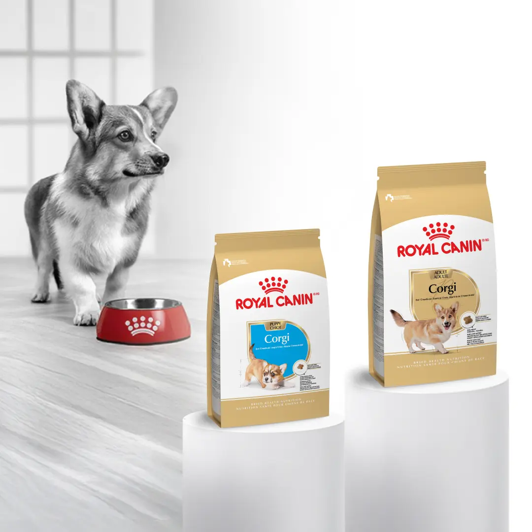
Royal Canin
UX + UI Design, Autoship Feature, Account Dashboard
View the Case Study →

Wolters Kluwer Health is a leading provider of clinical technology, evidence-based medical information, and software solutions for the healthcare industry. When the creative team introduced a new brand identity, I collaborated with marketing and product teams to support its consistent roll-out across internal and consumer-facing environments—a process that required precision and careful coordination.
I designed and maintained internal websites to organize and distribute the updated design system, including branded digital marketing templates, diverse region-specific photography, and reusable interface assets. This work helped create a centralized, scalable resource for teams implementing the new brand across digital experiences.
The new design system was distributed through the designers within the organization. As stewards of the brand, it was my responsibility to implement and contribute to the new system. I organized an internal library to host easily accessible reusable components for marketing and sales partners.
As a healthtech company, the trust between the brand, healthcare providers, and their patients is vital. In order to help strengthen that trust, we built a library of region-specific images and graphics to be used for global audiences.
The Wolters Kluwer design system is a tight, minimalist aesthetic built on a precisely determined grid structure. I built numerous templates for patient literature, social media graphics, web components, and presentation designs that adhered to strict brand rules.
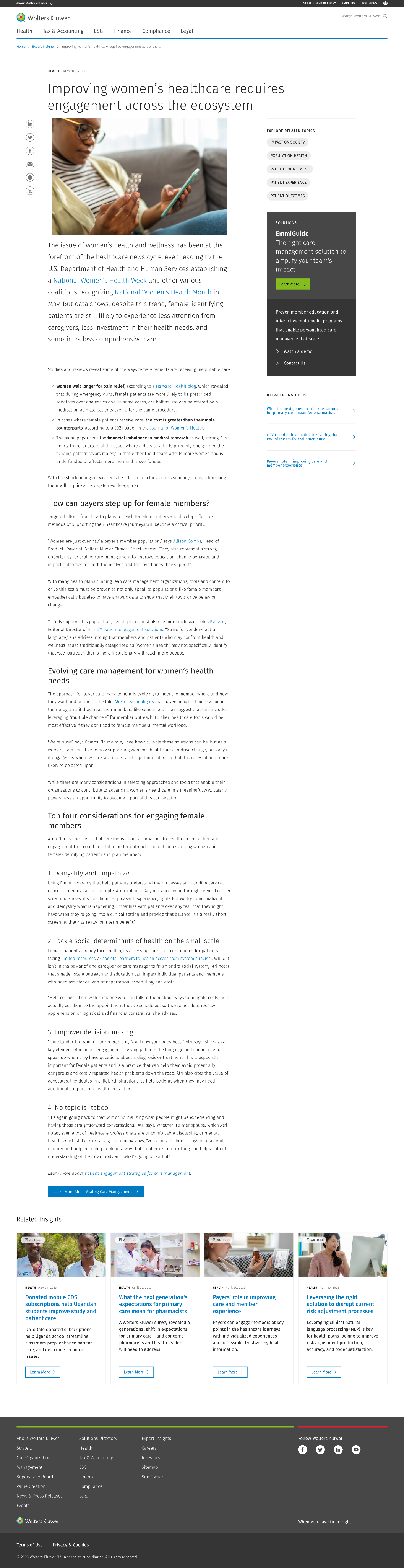
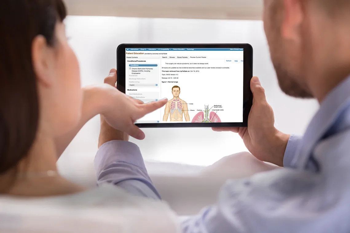
Desktop display of WK Health ‘Expert Insights’ online resources featuring new design system components and branding
10+
HEALTHCARE PRODUCT SOLUTIONS

Software, medical journals, eBooks, patient resources, pharmeceutical literatute and more
Complex global market
2 million
CLINICIAN USERS
Amongst 44,000 healthcare institutions
Customers in 180+ countries
Updating the organization’s websites to reflect the new design system was a large-scale effort involving numerous page templates, interfaces, and content types. Beyond applying the new visual language, existing UI patterns and content needed to be systematically replaced or redesigned to create a cohesive experience across the broader digital ecosystem. I collaborated closely with project managers and copywriters to coordinate the rollout, align content and design updates, and manage dependencies across teams.
To prioritize the work, we analyzed site traffic data to identify the highest-value pages and focused initial efforts where the new designs would have the greatest impact. This data-informed approach allowed us to establish a structured release sequence, gradually bringing high-traffic and priority pages into alignment with the new design system while maintaining consistency across the site.
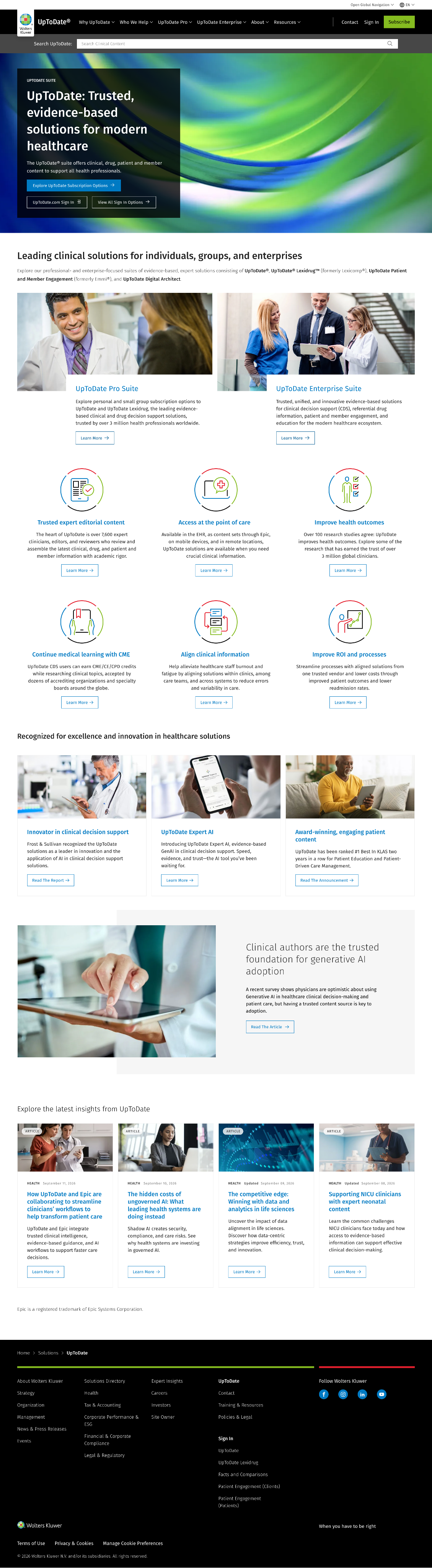
Content site design on desktop, utlizing custom icons, design system artifacts and curated photography.
Despite the release of rebranded logos and guidelines, the designs still needed implemented across a complex environment of digital and analog resources. To help automate the use of the new brand, digital templates were built for non-design roles to access and utlize as needed.
Curated collection of inclusive imagery to represent diverse audiences and remains relevant across the brand today.
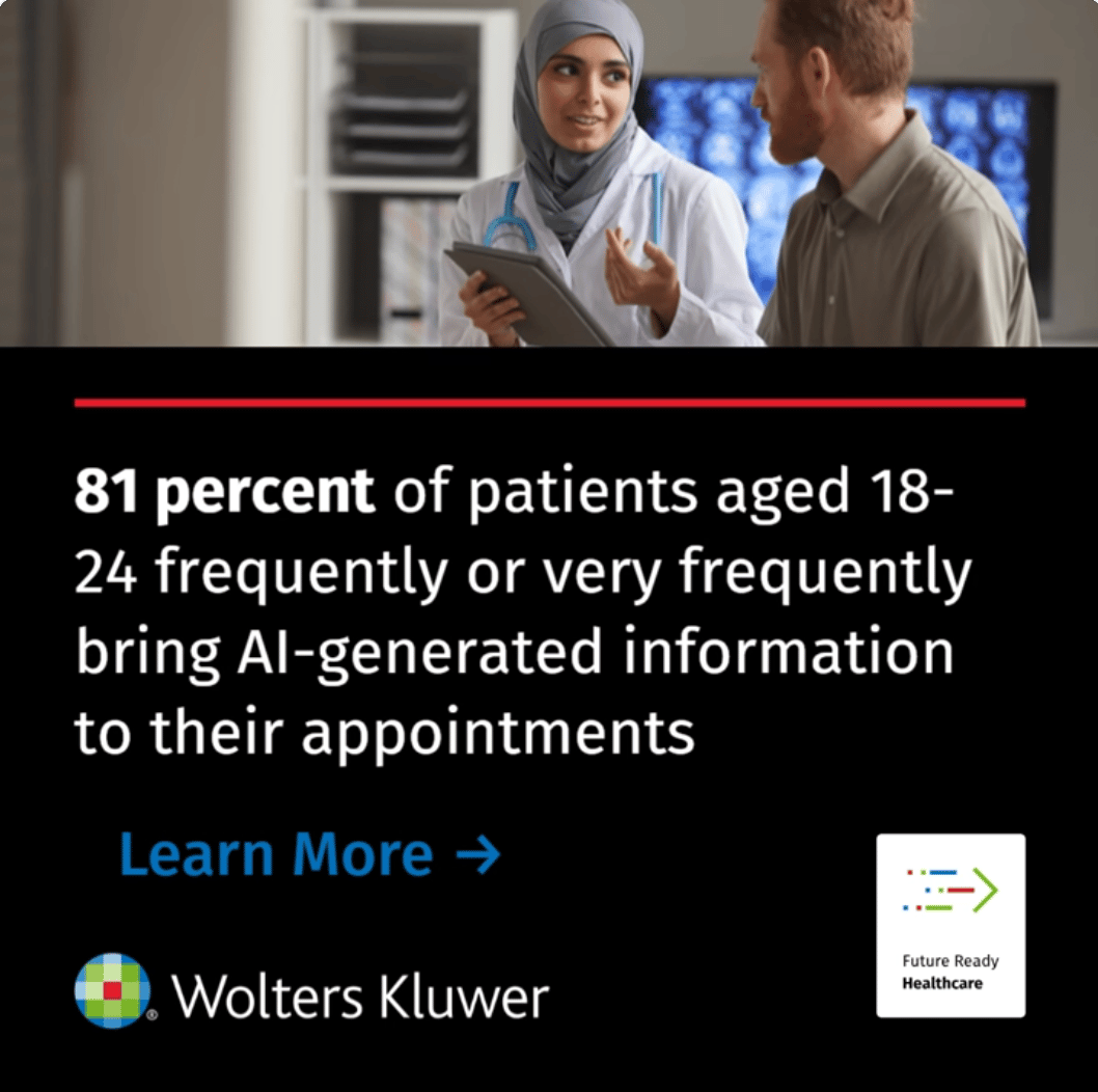
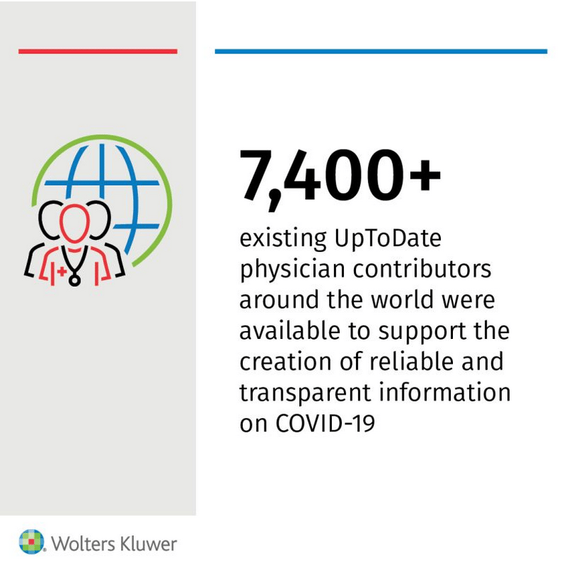
Graphic LinkedIn post with custom iconography.
Customized stock photography to create realistic & relatable patient content.
Photography and visual assets were intentionally curated to reflect the diverse audiences served across different regions and clinical environments. Rather than relying on a one-size-fits-all library, imagery was selected to represent differences in age, ethnicity, culture, and lived experience, with region-specific assets helping local audiences see themselves reflected in the resources they use. In healthcare, this representation can help make clinical information feel more relevant and approachable, supporting greater familiarity and trust by showing patients that people like them are considered within the experience.
Designs of clinical literature utilizing newly designed iconography and components adhering to the global design system.
Used website traffic data to prioritize high-impact page updates while curating diverse, region-specific photography that reflected the patients and audiences.
Played a major part in distributing and translating a new brand identity amongst a large ecosystem of digital and analog experiences.
Maintained internal websites to provide a centralized design resources hub for marketing teams.
Note: Due to proprietary restrictions, sharing assets of the Wolters Kluwer Design System is limited.
Royal Canin
UX + UI Design, Autoship Feature, Account Dashboard
View the Case Study →
Syndicate Floral
UX + UI Design, Design System Creation, eCommerce
View the Case Study →
Lindsay Howell
Wolters Kluwer Health is a leading provider of clinical technology, evidence-based medical information, and software solutions for the healthcare industry. When the creative team introduced a new brand identity, I collaborated with marketing and product teams to support its consistent roll-out across internal and consumer-facing environments—a process that required precision and careful coordination.
I designed and maintained internal websites to organize and distribute the updated design system, including branded digital marketing templates, diverse region-specific photography, and reusable interface assets. This work helped create a centralized, scalable resource for teams implementing the new brand across digital experiences.
The new design system was distributed through the designers within the organization. As stewards of the brand, it was my responsibility to implement and contribute to the new system. I organized an internal library to host easily accessible reusable components for marketing and sales partners.
As a healthtech company, the trust between the brand, healthcare providers, and their patients is vital. In order to help strengthen that trust, we built a library of region-specific images and graphics to be used for global audiences.
The Wolters Kluwer design system is a tight, minimalist aesthetic built on a precisely determined grid structure. I built numerous templates for patient literature, social media graphics, web components, and presentation designs that adhered to strict brand rules.
Desktop display of WK Health ‘Expert Insights’ online resources featuring new design system components and branding
10+
HEALTHCARE PRODUCT SOLUTIONS
Software, medical journals, eBooks, patient resources, pharmeceutical literatute and more
Complex global market
2 million
CLINICIAN USERS
Amongst 44,000 healthcare institutions
Customers in 180+ countries
Updating the organization’s websites to reflect the new design system was a large-scale effort involving numerous page templates, interfaces, and content types. Beyond applying the new visual language, existing UI patterns and content needed to be systematically replaced or redesigned to create a cohesive experience across the broader digital ecosystem. I collaborated closely with project managers and copywriters to coordinate the rollout, align content and design updates, and manage dependencies across teams.
To prioritize the work, we analyzed site traffic data to identify the highest-value pages and focused initial efforts where the new designs would have the greatest impact. This data-informed approach allowed us to establish a structured release sequence, gradually bringing high-traffic and priority pages into alignment with the new design system while maintaining consistency across the site.
Content site design on desktop, utlizing custom icons, design system artifacts and curated photography.
Despite the release of rebranded logos and guidelines, the designs still needed implemented across a complex environment of digital and analog resources. To help automate the use of the new brand, digital templates were built for non-design roles to access and utlize as needed.
Curated collection of inclusive imagery to represent diverse audiences and remains relevant across the brand today.
Graphic LinkedIn post with custom iconography.
Customized stock photography to create realistic & relatable patient content.
Photography and visual assets were intentionally curated to reflect the diverse audiences served across different regions and clinical environments. Rather than relying on a one-size-fits-all library, imagery was selected to represent differences in age, ethnicity, culture, and lived experience, with region-specific assets helping local audiences see themselves reflected in the resources they use. In healthcare, this representation can help make clinical information feel more relevant and approachable, supporting greater familiarity and trust by showing patients that people like them are considered within the experience.
Designs of clinical literature utilizing newly designed iconography and components adhering to the global design system.
Used website traffic data to prioritize high-impact page updates while curating diverse, region-specific photography that reflected the patients and audiences.
Played a major part in distributing and translating a new brand identity amongst a large ecosystem of digital and analog experiences.
Maintained internal websites to provide a centralized design resources hub for marketing teams.
Note: Due to proprietary restrictions, sharing assets of the Wolters Kluwer Design System is limited.
Royal Canin
UX + UI Design, Autoship Feature, Account Dashboard
View the Case Study →
Syndicate Floral
UX + UI Design, Design System Creation, eCommerce
View the Case Study →
Lindsay Howell
Wolters Kluwer Health is a leading provider of clinical technology, evidence-based medical information, and software solutions for the healthcare industry. When the creative team introduced a new brand identity, I collaborated with marketing and product teams to support its consistent roll-out across internal and consumer-facing environments—a process that required precision and careful coordination.
I designed and maintained internal websites to organize and distribute the updated design system, including branded digital marketing templates, diverse region-specific photography, and reusable interface assets. This work helped create a centralized, scalable resource for teams implementing the new brand across digital experiences.
The new design system was distributed through the designers within the organization. As stewards of the brand, it was my responsibility to implement and contribute to the new system. I organized an internal library to host easily accessible reusable components for marketing and sales partners.
As a healthtech company, the trust between the brand, healthcare providers, and their patients is vital. In order to help strengthen that trust, we built a library of region-specific images and graphics to be used for global audiences.
The Wolters Kluwer design system is a tight, minimalist aesthetic built on a precisely determined grid structure. I built numerous templates for web components, patient literature, social media graphics, and presentation designs that adhered to strict brand rules.
Desktop display of WK Health ‘Expert Insights’ online resources featuring new design system components and branding
10+
HEALTHCARE PRODUCT SOLUTIONS
Providing software, medical journals, eBooks, patient resources, pharmaceutical literature, and more
Complex global market
2 million
CLINICIAN USERS
Serving within 44,000+ healthcare institutions
Customers in 180+ countries
Updating the organization’s websites to reflect the new design system was a large-scale effort involving numerous page templates, interfaces, and content types. Beyond applying the new visual language, existing UI patterns and content needed to be systematically replaced or redesigned to create a cohesive experience across the broader digital ecosystem. I collaborated closely with project managers and copywriters to coordinate the rollout, align content and design updates, and manage dependencies across teams.
To prioritize the work, we analyzed site traffic data to identify the highest-value pages and focused initial efforts where the new designs would have the greatest impact. This data-informed approach allowed us to establish a structured release sequence, gradually bringing high-traffic and priority pages into alignment with the new design system while maintaining consistency across the site.
Content site design on desktop, utlizing custom icons, design system artifacts and curated photography.
Rebranding the organization required more than updating logos and guidelines—it meant translating the new visual system into a broad ecosystem of digital and physical communications. To make the new brand accessible at scale, I designed a diverse library of ready-to-use templates for non-design teams across Photoshop, Illustrator, Canva, Word, and PowerPoint. These included marketing materials, presentations, documents, digital communications, and other recurring team needs, giving employees flexible tools to create on-brand materials without relying on a designer for every request.
I also created custom icons and supporting interface assets to accommodate unique use cases while expanding the shared component library. These resources were organized within an internal design system portal where teams could browse, preview, and download approved templates, photography, and web assets. Each resource was designed to closely adhere to the new visual system, balancing flexibility for a large organization with the consistency required for a successful rebrand.
Curated collection of inclusive imagery to represent diverse audiences and remains relevant across the brand today.
Graphic LinkedIn post with custom iconography.
Customized stock photography to create realistic & relatable patient content.
Photography and visual assets were intentionally curated to reflect the diverse audiences served across different regions and clinical environments. Rather than relying on a one-size-fits-all library, imagery was selected to represent differences in age, ethnicity, culture, and lived experience, with region-specific assets helping local audiences see themselves reflected in the resources they use. In healthcare, this representation can help make clinical information feel more relevant and approachable, supporting greater familiarity and trust by showing patients that people like them are considered within the experience.
Designs of clinical literature utilizing newly designed iconography and components adhering to the global design system.
Used website traffic data to prioritize high-impact page updates while curating diverse, region-specific photography that reflected the patients and audiences.
Maintained internal websites to provide a centralized design resources hub for marketing teams.
Played a major part in distributing and translating a new brand identity amongst a large ecosystem of digital and analog experiences.
Note: Due to proprietary restrictions, sharing assets of the Wolters Kluwer Design System is limited.
Royal Canin
UX + UI Design, Autoship Feature, Account Dashboard
View the Case Study →
Syndicate Floral
UX + UI Design, Design System Creation, eCommerce
View the Case Study →