Royal Canin
UX + UI Design, Autoship Feature, Account Dashboard
View the Case Study →

Syndicate Floral Hardgoods is a go-to manufacturer and distributor for professional florists. Their products are sought out by small businesses and corporate supermarkets alike. Syndicate had recently acquired and started selling products from adjacent brands for ribbons, outdoor landscaping decor, and floral event displays. Due to these acquisitions, the business approached my team to design a brand new website that consolidated the products and functionality of their family of brands under one domain.
In collaboration with the Syndicate team, project management, and developers, we designed an end-to-end solution that prioritized Syndicate’s new branding and highlighted variant experiences for customer segments. We worked together from research to launch to ensure the website would capture all the needs of all user types.
The client wanted to start with a blank slate. No elements from the previous interface were being reused so the new product design system was built from scratch. Style guides defined CSS components and a reusable component library was designed for handoff. This guaranteed consistency now and in the future for new designs.
The Syndicate website was completely overhauled from their previous website design. With an opportunity to start fresh, we took a detailed look at improving the full user experience. From research to handoff, our team worked closely every step of the way to launch an exciting new website with a fully customizable CMS for client-side management.
Syndicate customer segmentation goes beyond marketing funnels and persona types. Experiences were customized for role-based permissions and multi-user account management. We built unique tools and personalized user flows for parent wholesaler accounts, individual small business accounts, and administrative sales accounts.
The desktop homepage design highlights eye-catching imagery inspired by direct-to-consumer e-commerce experiences and features a double-stacked header navigation to accommodate an extensive product catalog.
The project began with thorough investigation into the current website’s successes and pain points. I worked with the client to coordinate user interviews. I conducted surveys and focus group discussions with internal stakeholders to hear their opinions and vision for the new website. I analyzed competitor’s and consumer websites, and reviewed the creative direction for the business’ rebrand.
Given the large amount of information and a tight timeline to deliver results, I used AI-assistance to synthesizing the written data. The output presented clear patterns that I was then able to review and document for presentation. I was able to further save time by continuing to use AI assistance for mapping site navigation and information architecture. Having shared this analysis with client stakeholders, the project was green-lit for further design and development.
A map comparing the original and new information architecture. The desktop homepage design highlights eye-catching imagery inspired by direct-to-consumer e-commerce experiences and features a double-stacked header navigation to accommodate an extensive product catalog.
13,000
ACCOUNT USERS

100 wholesaler accounts with linked retail-user relationships
Global market leader in prescription pet food
Millions of monthly website visits
2,000+
PRODUCT SKUS
Real-time inventory and pricing
Seasonal and pre-book products purchased async
Dynamic price management for wholesalers
The website redesign began with wireframe layouts for every major page design in the site map. This gave the team an opportunity to map the functional details of the designs before addressing visual interest of the interface. Working as a cross-functional group, the wireframe phase was full of layout iterations and constant contact between project managers, client stakeholders, developers, and myself as the designer. We knew we needed to build complex functionality and custom tools into the site experience and wanted to ensure the team’s vision was aligned from the start. This phase was the foundation of defining user journeys and workflows.
Wireframe of new personalized dashboard experience for authenticated users.
Wireframe of new functionality for cart preview drawer.
Wireframe layout of new custom price management tool for administrative users.
With the wireframe foundation in place, the visual designs started coming alive with brand elements, high-quality product imagery and a thoughtfully produced design system. Keeping accessibility in mind, the client’s brand colors were a small challenge to sort out. Their particular shades of green and pink did not pass WCAG (Web Content Accessibility Guideline) contrast standards for color application on a digital interface. Before moving forward with branded interface designs, we addressed this concern. I offered slight shifts in color and proposed multiple options for site styling that would satisfy accessibility needs. Working together, we found a solution that addressed accebbility without compromising their brand guide.
Visualizing the difference between brand colors and proposed color shifts for more accessible color contrast ratings, according to WCAG.
One of the biggest upgrades to the website features would be the self-service tools available to customers. Successfully implementing user-based tools would lessen calls to the support desk and give users more independence over their account settings. As the Syndicate audience expanded, their user base also became younger and more tech-savvy, expecting website tools that other eCommerce platforms provide.
Problem:
Customer service team members had to manually process new account requests.

Solution:
Implemented an online form for new customer registraion.
Problem:
Carts abandoned because users could only complete checkout with a ‘terms’ account.
Solution:
Problem:
Users that managed multiple accounts had to use unique credentials for each instance.
Solution:
Implemented an online form for new customer registraion.
Problem:
Wholesale users did not have access to adjusting prices of their retailer product catalog.
Solution:
Implemented an online form for new customer registraion.
Problem:
Users had to contact sales representatives to purchase pre-sale items.
Solution:
Implemented an online form for new customer registraion.
Newly defined automation for online account registration eliminates the need for customer service representatives to manually process new accounts.
Defined product landing pages for unique pre-order items.
Newly organized navigation architecture based on business channels.
Cart design with clear messaging for unique shipping scenarios.
As the business continues to evolve, their user audience also becomes younger and more technically savvy. It was vital that our new website design gave users more tools than ever to self-manage accounts. The previous generation of Syndicate’s primary audience was a user base of ‘mom and pop’ brick and mortar storefronts that had a preference for sales relationships and manual processes. The newer generation of Syndicate’s users expect more independence over their accounts and quick, reliable online experiences. Our design was sure to honor the homespun feel of the brand while providing modern tools that give users complete access to complex account tools without contacting support.
New user dashboards designed for quick access to account tools and tasks based on account type. Variable user experiences previously did not exist for any user type.
Confidently handed off a complete design system with a refined style guide for development and future designs.
Successfully met business goals, designed new user flows and features, and launched a new website in time for peak sales seasons.
Full end-to-end design process with custom design system and tight collaboration throughout the project.
Royal Canin
UX + UI Design, Autoship Feature, Account Dashboard
View the Case Study →
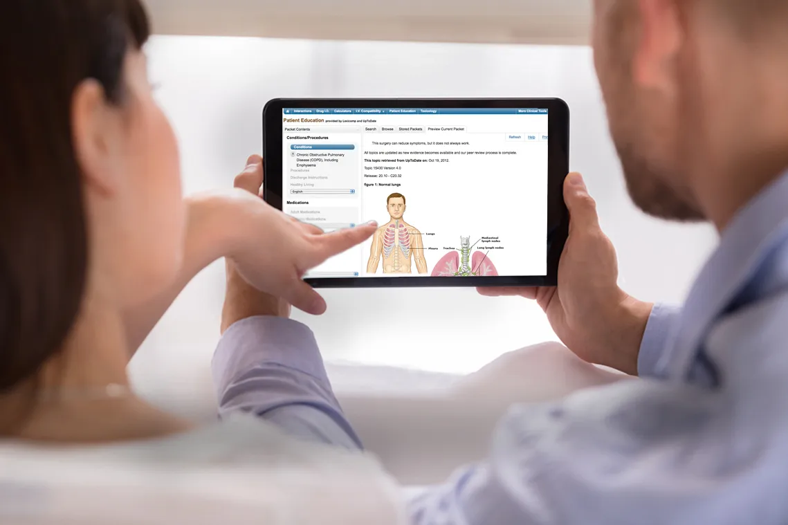
Wolters Kluwer Health
UI Design, Design System Management, SaaS, Brand Design, Marketing
View the Case Study →
Lindsay Howell
Syndicate Floral Hardgoods is a go-to manufacturer and distributor for professional florists. Their products are sought out by small businesses and corporate supermarkets alike. Syndicate had recently acquired and started selling products from adjacent brands for ribbons, outdoor landscaping decor, and floral event displays. Due to these acquisitions, the business approached my team to design a brand new website that consolidated the products and functionality of their family of brands under one domain.
In collaboration with the Syndicate team, project management, and developers, we designed an end-to-end solution that prioritized Syndicate’s new branding and highlighted variant experiences for customer segments. We worked together from research to launch to ensure the website would capture all the needs of all user types.
The Syndicate website was completely overhauled from their previous website design. With an opportunity to start fresh, we took a detailed look at improving the full user experience. From research to handoff, our team worked closely every step of the way to launch an exciting new website with a fully customizable CMS for client-side management.
The client wanted to start with a blank slate. No elements from the previous interface were being reused so the new product design system was built from scratch. Style guides defined CSS components and a reusable component library was designed for handoff. This guaranteed consistency now and in the future for new designs.
Syndicate customer segmentation goes beyond marketing funnels and persona types. Experiences were customized for role-based permissions and multi-user account management. We built unique tools and personalized user flows for parent wholesaler accounts, individual small business accounts, and administrative sales accounts.
The desktop homepage design highlights eye-catching imagery inspired by direct-to-consumer e-commerce experiences and features a double-stacked header navigation to accommodate an extensive product catalog.
The project began with thorough investigation into the current website’s successes and pain points. I worked with the client to coordinate user interviews. I conducted surveys and focus group discussions with internal stakeholders to hear their opinions and vision for the new website. I analyzed competitor’s and consumer websites, and reviewed the creative direction for the business’ rebrand.
Given the large amount of information and a tight timeline to deliver results, I used AI-assistance to synthesizing the written data. The output presented clear patterns that I was then able to review and document for presentation. I was able to further save time by continuing to use AI assistance for mapping site navigation and information architecture. Having shared this analysis with client stakeholders, the project was green-lit for further design and development.
A map comparing the original and new information architecture. The desktop homepage design highlights eye-catching imagery inspired by direct-to-consumer e-commerce experiences and features a double-stacked header navigation to accommodate an extensive product catalog.
13,000
ACCOUNT USERS
100 wholesaler accounts with linked retail-user relationships
Global market leader in prescription pet food
Millions of monthly website visits
2,000+
PRODUCT SKUS
Real-time inventory and pricing
Seasonal and pre-book products purchased async
Dynamic price management for wholesalers
The website redesign began with wireframe layouts for every major page design in the site map. This gave the team an opportunity to map the functional details of the designs before addressing visual interest of the interface. Working as a cross-functional group, the wireframe phase was full of layout iterations and constant contact between project managers, client stakeholders, developers, and myself as the designer. We knew we needed to build complex functionality and custom tools into the site experience and wanted to ensure the team’s vision was aligned from the start. This phase was the foundation of defining user journeys and workflows.
Wireframe of new personalized dashboard experience for authenticated users.
Wireframe of new functionality for cart preview drawer.
Wireframe layout of new custom price management tool for administrative users.
With the wireframe foundation in place, the visual designs started coming alive with brand elements, high-quality product imagery and a thoughtfully produced design system. Keeping accessibility in mind, the client’s brand colors were a small challenge to sort out. Their particular shades of green and pink did not pass WCAG (Web Content Accessibility Guideline) contrast standards for color application on a digital interface. Before moving forward with branded interface designs, we addressed this concern. I offered slight shifts in color and proposed multiple options for site styling that would satisfy accessibility needs. Working together, we found a solution that addressed accebbility without compromising their brand guide.
Visualizing the difference between brand colors and proposed color shifts for more accessible color contrast ratings, according to WCAG.
One of the biggest upgrades to the website features would be the self-service tools available to customers. Successfully implementing user-based tools would lessen calls to the support desk and give users more independence over their account settings. As the Syndicate audience expanded, their user base also became younger and more tech-savvy, expecting website tools that other eCommerce platforms provide.
Problem:
Carts abandoned because users could only complete checkout with a ‘terms’ account.
Solution:
Problem:
Customer service team members had to manually process new account requests.
Solution:
Implemented an online form for new customer registraion.
Problem:
Users that managed multiple accounts had to use unique credentials for each instance.
Solution:
Implemented an online form for new customer registraion.
Problem:
Wholesale users did not have access to adjusting prices of their retailer product catalog.
Solution:
Implemented an online form for new customer registraion.
Problem:
Users had to contact sales representatives to purchase pre-sale items.
Solution:
Implemented an online form for new customer registraion.
Newly defined automation for online account registration eliminates the need for customer service representatives to manually process new accounts.
Defined product landing pages for unique pre-order items.
Newly organized navigation architecture based on business channels.
Cart design with clear messaging for unique shipping scenarios.
As the business continues to evolve, their user audience also becomes younger and more technically savvy. It was vital that our new website design gave users more tools than ever to self-manage accounts. The previous generation of Syndicate’s primary audience was a user base of ‘mom and pop’ brick and mortar storefronts that had a preference for sales relationships and manual processes. The newer generation of Syndicate’s users expect more independence over their accounts and quick, reliable online experiences. Our design was sure to honor the homespun feel of the brand while providing modern tools that give users complete access to complex account tools without contacting support.
New user dashboards designed for quick access to account tools and tasks based on account type. Variable user experiences previously did not exist for any user type.
Confidently handed off a complete design system with a refined style guide for development and future designs.
Successfully met business goals, designed new user flows and features, and launched a new website in time for peak sales seasons.
Full end-to-end design process with custom design system and tight collaboration throughout the project.
Royal Canin
UX + UI Design, Autoship Feature, Account Dashboard
View the Case Study →
Wolters Kluwer Health
UI Design, Design System Management, SaaS, Brand Design, Marketing
View the Case Study →
Lindsay Howell
Syndicate Floral Hardgoods is a go-to manufacturer and distributor for professional florists. Their products are sought out by small businesses and corporate supermarkets alike. Syndicate had recently acquired and started selling products from adjacent brands for ribbons, outdoor landscaping decor, and floral event displays. Due to these acquisitions, the business approached my team to design a brand new website that consolidated the products and functionality of their family of brands under one domain.
In collaboration with the Syndicate team, project management, and developers, we designed an end-to-end solution that prioritized Syndicate’s new branding and highlighted variant experiences for customer segments. We worked together from research to launch to ensure the website would capture all the needs of all user types.
The Syndicate website was completely overhauled from their previous website design. With an opportunity to start fresh, we took a detailed look at improving the full user experience. From research to handoff, our team worked closely every step of the way to launch an exciting new website with a fully customizable CMS for client-side management.
The client wanted to start with a blank slate. No elements from the previous interface were being reused so the new product design system was built from scratch. Style guides defined CSS components and a reusable component library was designed for handoff. This guaranteed consistency now and in the future for new designs.
Syndicate customer segmentation goes beyond marketing funnels and persona types. Experiences were customized for role-based permissions and multi-user account management. We built unique tools and personalized user flows for parent wholesaler accounts, individual small business accounts, and administrative sales accounts.
The desktop homepage design highlights eye-catching imagery inspired by direct-to-consumer e-commerce experiences and features a double-stacked header navigation to accommodate an extensive product catalog.
The project began with thorough investigation into the current website’s successes and pain points. I worked with the client to coordinate user interviews. I conducted surveys and focus group discussions with internal stakeholders to hear their opinions and vision for the new website. I analyzed competitor’s and consumer websites, and reviewed the creative direction for the business’ rebrand.
Given the large amount of information and a tight timeline to deliver results, I used AI-assistance to synthesizing the written data. The output presented clear patterns that I was then able to review and document for presentation. I was able to further save time by continuing to use AI assistance for mapping site navigation and information architecture. Having shared this analysis with client stakeholders, the project was green-lit for further design and development.
A map comparing the original and new information architecture. The desktop homepage design highlights eye-catching imagery inspired by direct-to-consumer e-commerce experiences and features a double-stacked header navigation to accommodate an extensive product catalog.
13,000
ACCOUNT USERS
100 wholesaler accounts with linked retail-user relationships
Global market leader in prescription pet food
Millions of monthly website visits
2,000+
PRODUCT SKUS
Real-time inventory and pricing
Seasonal and pre-book products purchased async
Dynamic price management for wholesalers
The website redesign began with wireframe layouts for every major page design in the site map. This gave the team an opportunity to map the functional details of the designs before addressing visual interest of the interface. Working as a cross-functional group, the wireframe phase was full of layout iterations and constant contact between project managers, client stakeholders, developers, and myself as the designer. We knew we needed to build complex functionality and custom tools into the site experience and wanted to ensure the team’s vision was aligned from the start. This phase was the foundation of defining user journeys and workflows.
Wireframe of new personalized dashboard experience for authenticated users.
Wireframe of new functionality for cart preview drawer.
Wireframe layout of new custom price management tool for administrative users.
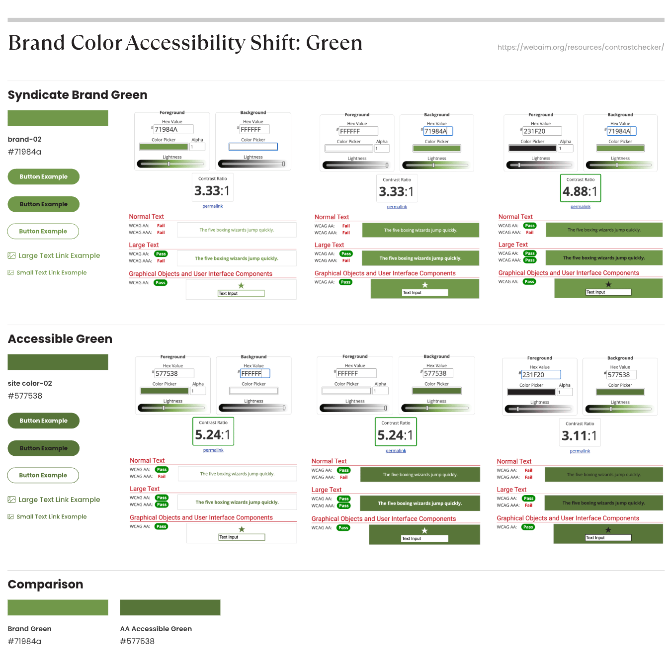
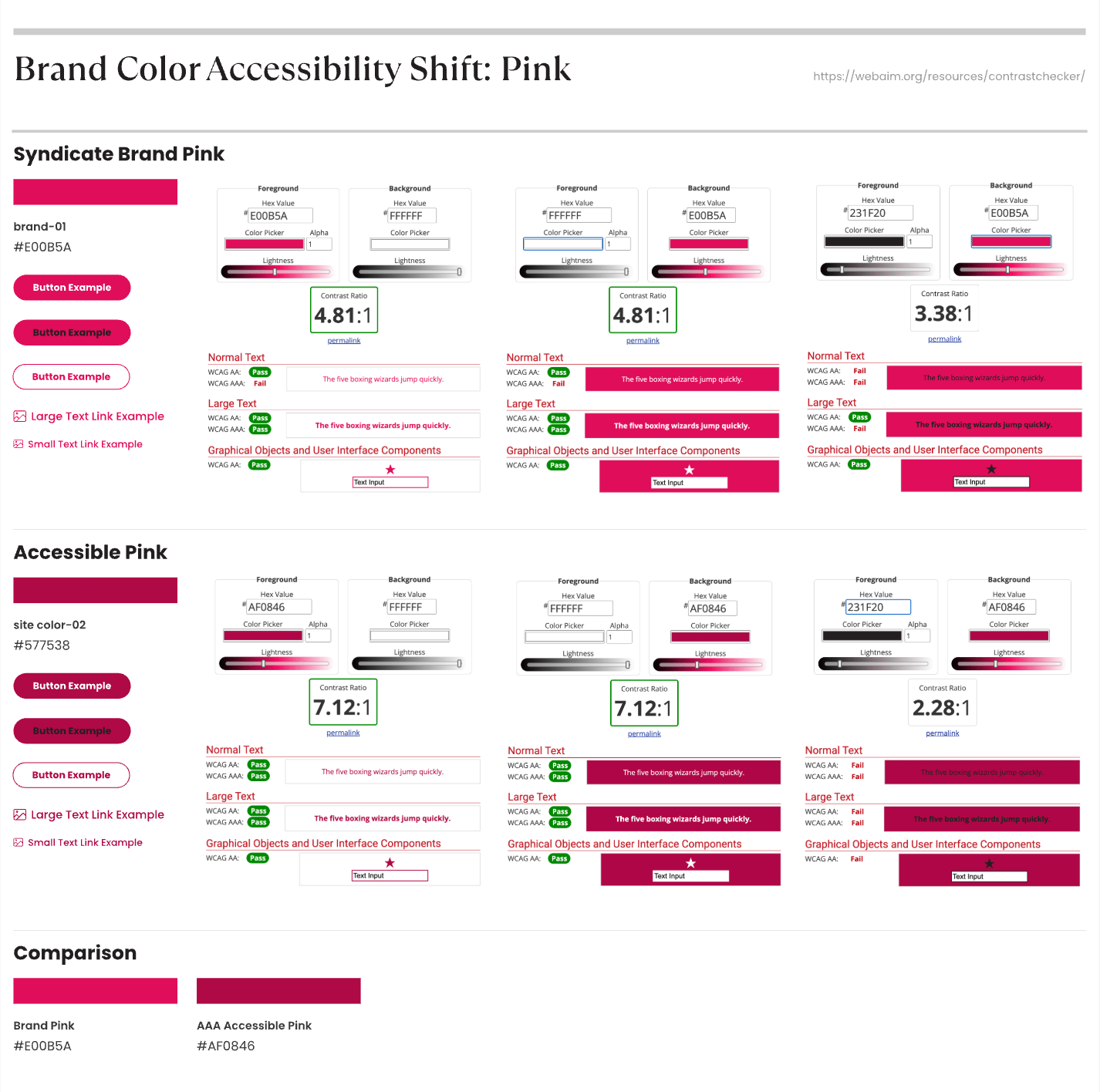
With the wireframe foundation in place, the visual designs started coming alive with brand elements, high-quality product imagery and a thoughtfully produced design system. Keeping accessibility in mind, the client’s brand colors were a small challenge to sort out. Their particular shades of green and pink did not pass WCAG (Web Content Accessibility Guideline) contrast standards for color application on a digital interface. Before moving forward with branded interface designs, we addressed this concern. I offered slight shifts in color and proposed multiple options for site styling that would satisfy accessibility needs. Working together, we found a solution that addressed accessibility without compromising their brand standards.
Visualizing the difference between brand colors and proposed color shifts for more accessible color contrast ratings, according to WCAG.
One of the biggest upgrades to the website features would be the self-service tools available to customers. Successfully implementing user-based tools would lessen calls to the support desk and give users more independence over their account settings. As the Syndicate audience expanded, their user base also became younger and more tech-savvy, expecting website tools that other eCommerce platforms provide.
Problem:
Carts abandoned because users could only complete checkout with a ‘terms’ account.

Solution:
Provided new checkout flows that allowed users to complete orders with credit card payments.
Problem:
Customer service team members had to manually process new account requests.
Solution:
Implemented an online form for new customer registration.
Problem:
Users that managed multiple accounts had to use unique credentials for each instance.
Solution:
Created parent/child relationships through linked accounts for single-sign-on access to manage multiple accounts under one profile.
Problem:
Wholesale users did not have access to adjusting prices of their retailer product catalog.
Solution:
Designed a new feature that allowed users to customize price markups per item, category, and catalog.
Problem:
Users had to contact sales representatives to purchase pre-sale items.
Solution:
Defined new purchasing flow to allow users to purchase pre-sale items as online orders.
Newly defined automation for online account registration eliminates the need for customer service representatives to manually process new accounts.
Defined product landing pages for unique pre-order items.
Newly organized navigation architecture based on business channels.
Cart design with clear messaging for unique shipping scenarios.
As the business continues to evolve, their user audience also becomes younger and more technically savvy. It was vital that our new website design gave users more tools than ever to self-manage accounts. The previous generation of Syndicate’s primary audience was a user base of ‘mom and pop’ brick and mortar storefronts that had a preference for sales relationships and manual processes. The newer generation of Syndicate’s users expect more independence over their accounts and quick, reliable online experiences. Our design was sure to honor the homespun feel of the brand while providing modern tools that give users complete access to complex account tools without contacting support.
New user dashboards designed for quick access to account tools and tasks based on account type. Variable user experiences previously did not exist for any user type.
Full end-to-end design process with custom design system and tight collaboration throughout the project.
Confidently handed off a complete design system with a refined style guide for development and future designs.
Successfully met business goals, designed new user flows and features, and launched a new website in time for peak sales seasons.
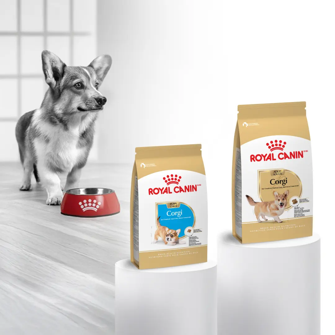
Royal Canin
UX + UI Design, Autoship Feature, Account Dashboard
View the Case Study →
Wolters Kluwer Health
UI Design, Design System Management, SaaS, Brand Design, Marketing
View the Case Study →